
THE PROJECT
Turn a vast catalog into a simple choice.
Furniture needs imagery and context, but a commercial website must also allow users to find categories, understand materials, and move toward an inquiry without getting lost.
The challenge was to balance an editorial product presentation with a clear architecture, especially on mobile and in journeys that start from a specific piece.
- THE ADDRESS
Design an exhibition that also knows how to guide.
The architecture separates inspiration, collection, and product information without breaking the user journey. Images gain space while filters, product pages, and calls to action appear right when they are needed.
We created a flexible component system to incorporate new collections and maintain consistency without making all pages identical.
- PROJECT GALLERY
The experience, from the storefront to every product.
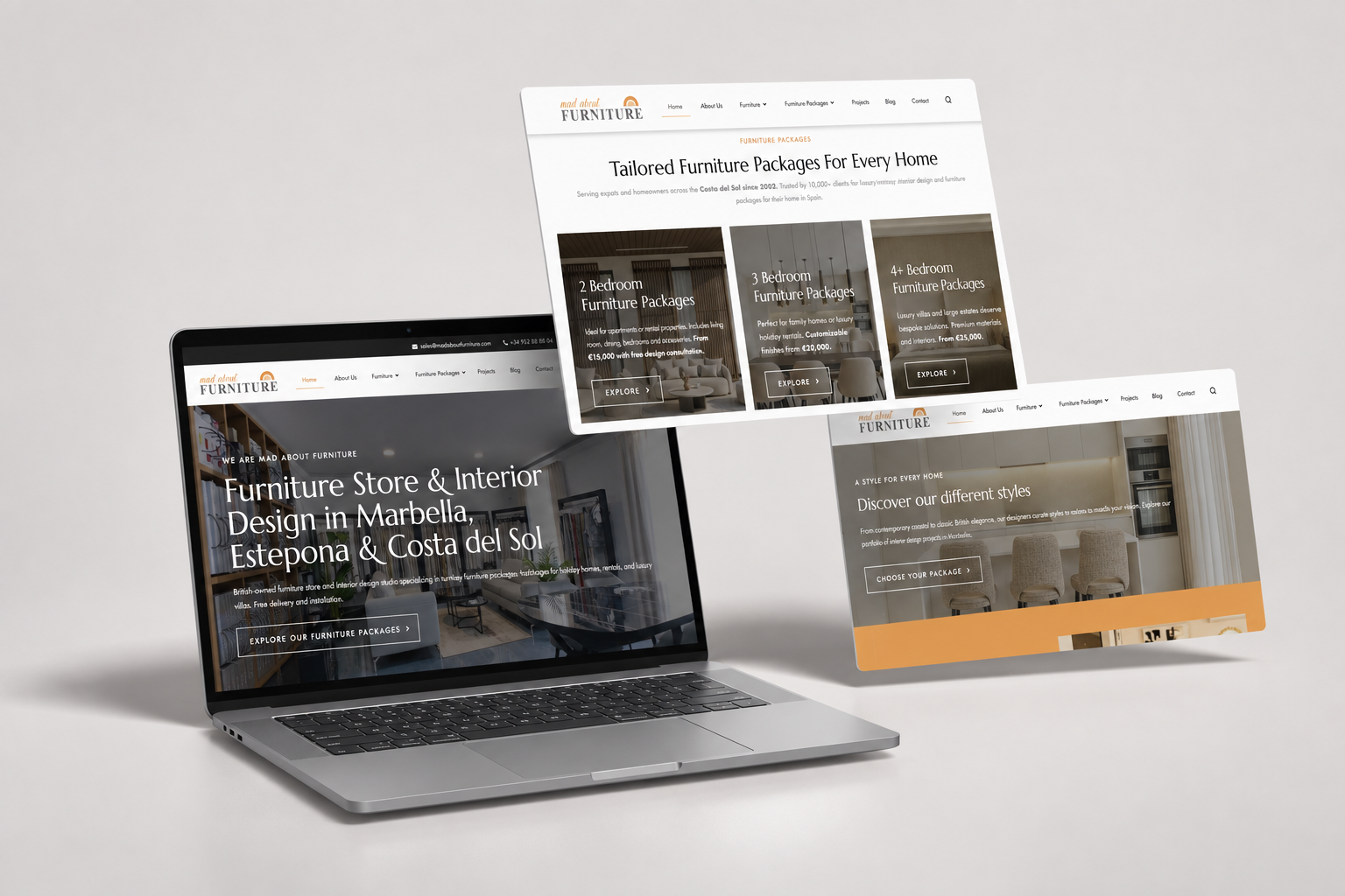
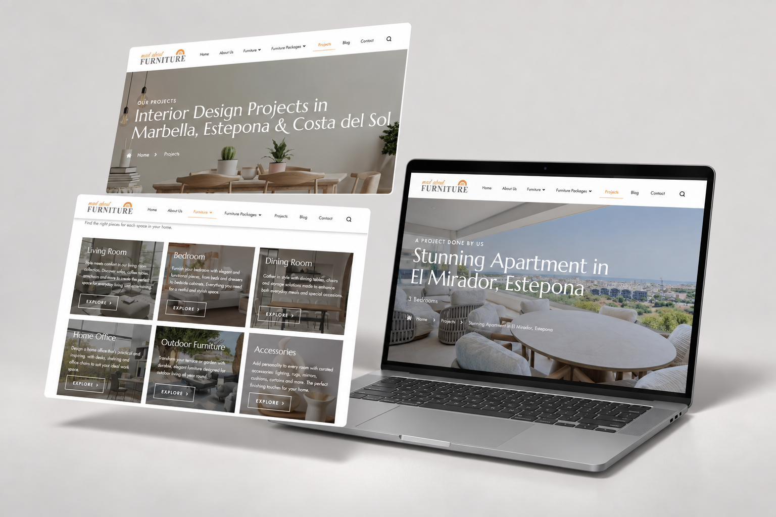
Screens prepared to present home page, categories, collections, product detail pages, search, and mobile adaptation.
- HOW WE WORK IT
01
Content and architecture
We organize catalogs, audiences, categories, and user journeys before designing screens.
02
UX and visual direction
We combine clear navigation, editorial rhythm, and product prominence.
03
Responsive and development
We build mobile-ready components, new collections, and future growth.
- THE RESULT
A website that showcases each piece better and helps you find it.
The new structure allows discovering, comparing, and consulting without turning the experience into a cold catalog.
01
Catalog architecture
02
UX/UI
03
Responsive design
04