THE PROJECT
Translate an idea into a complete language.
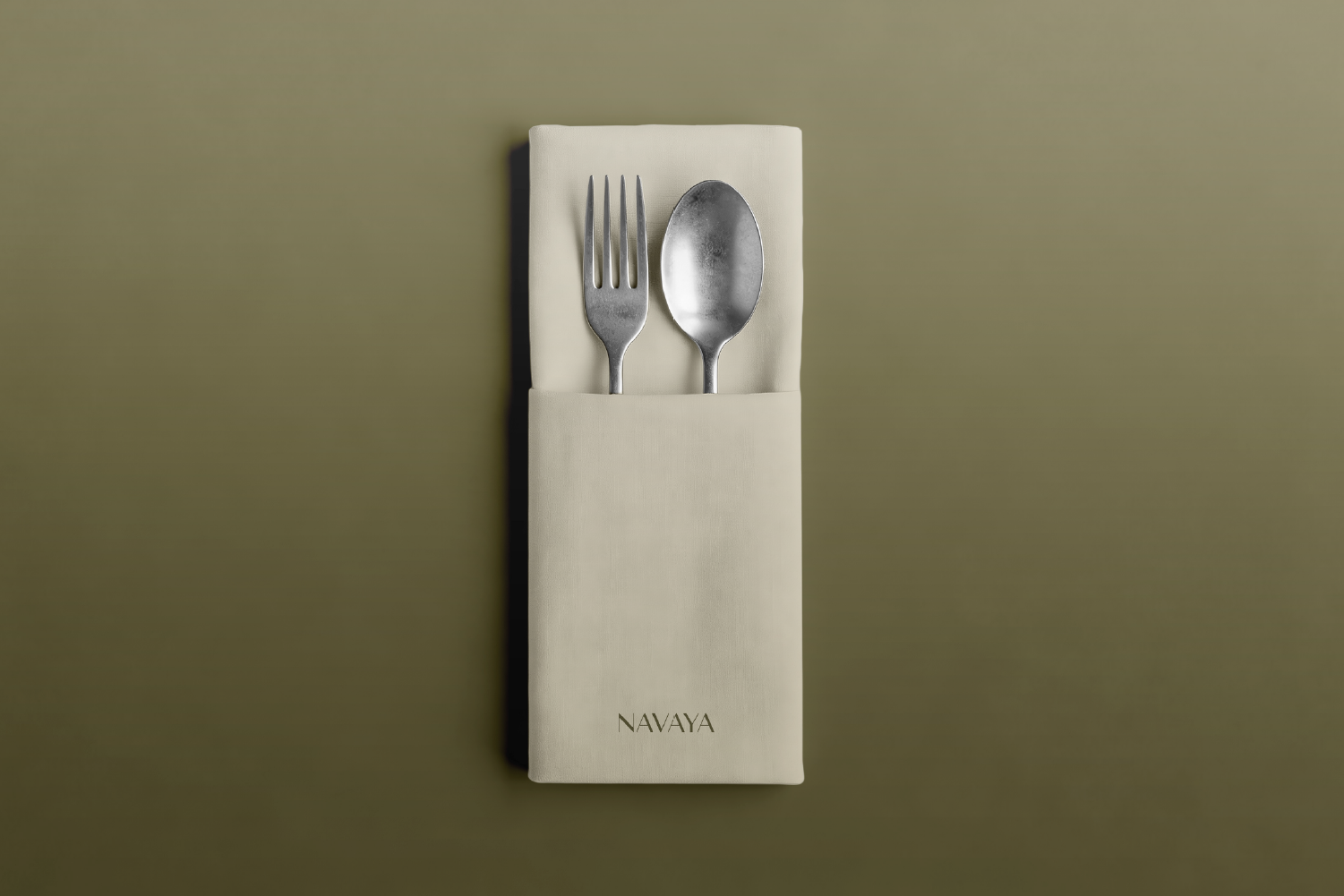
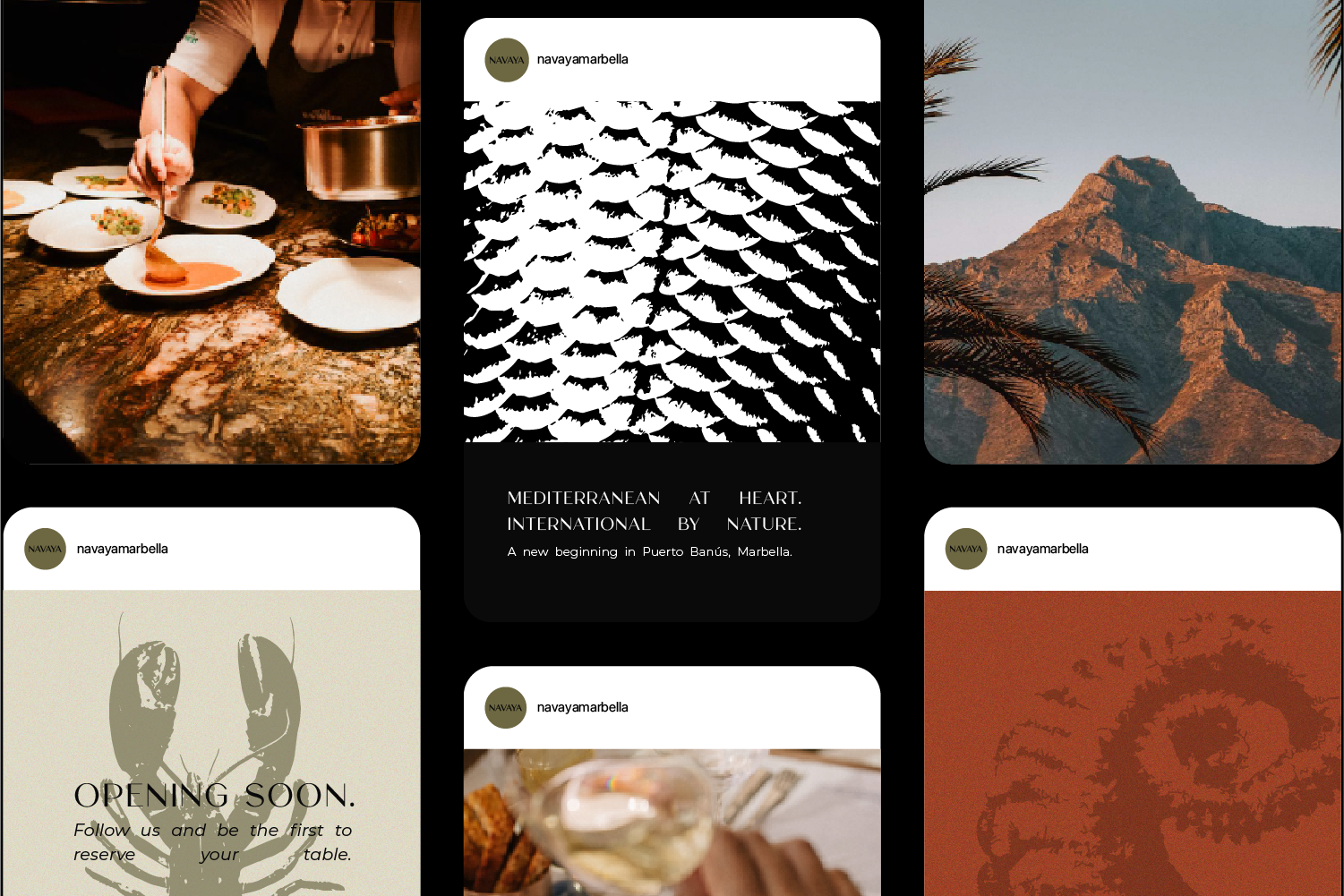
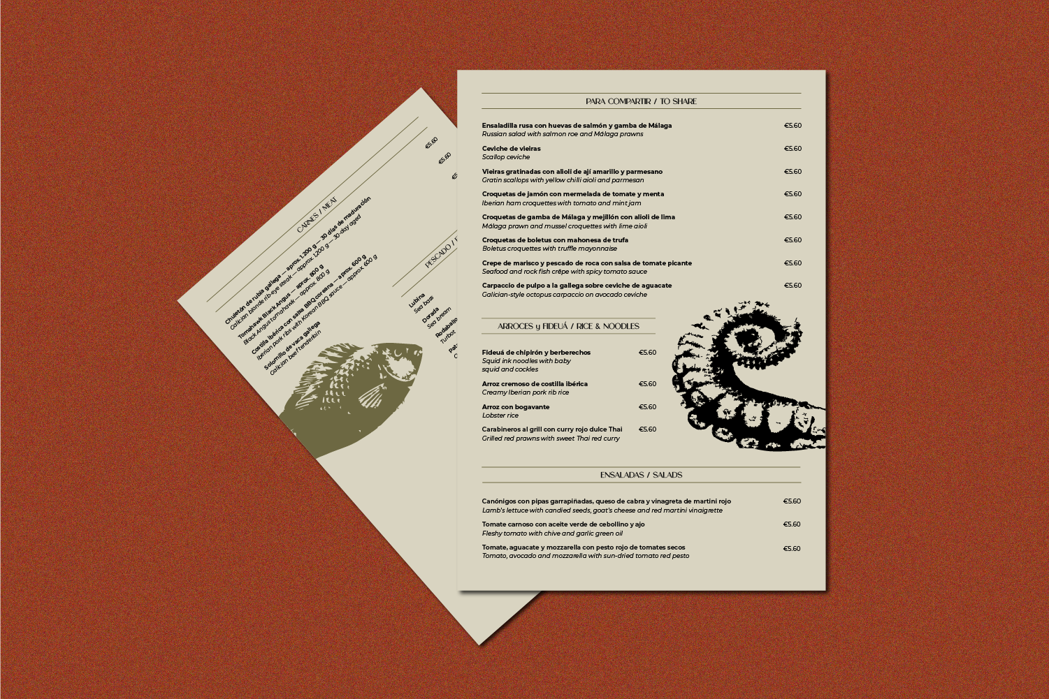
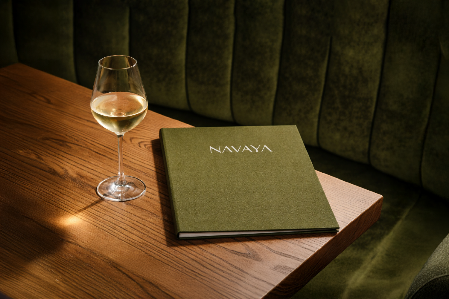
Navaya needed more than a logo: an identity capable of organizing its communication and functioning with the same personality across very different formats.
The challenge consisted of finding a unique code without depending on fleeting visual resources and leaving a simple system to apply as the brand grew.
- THE ADDRESS
Design recognition, not decoration.
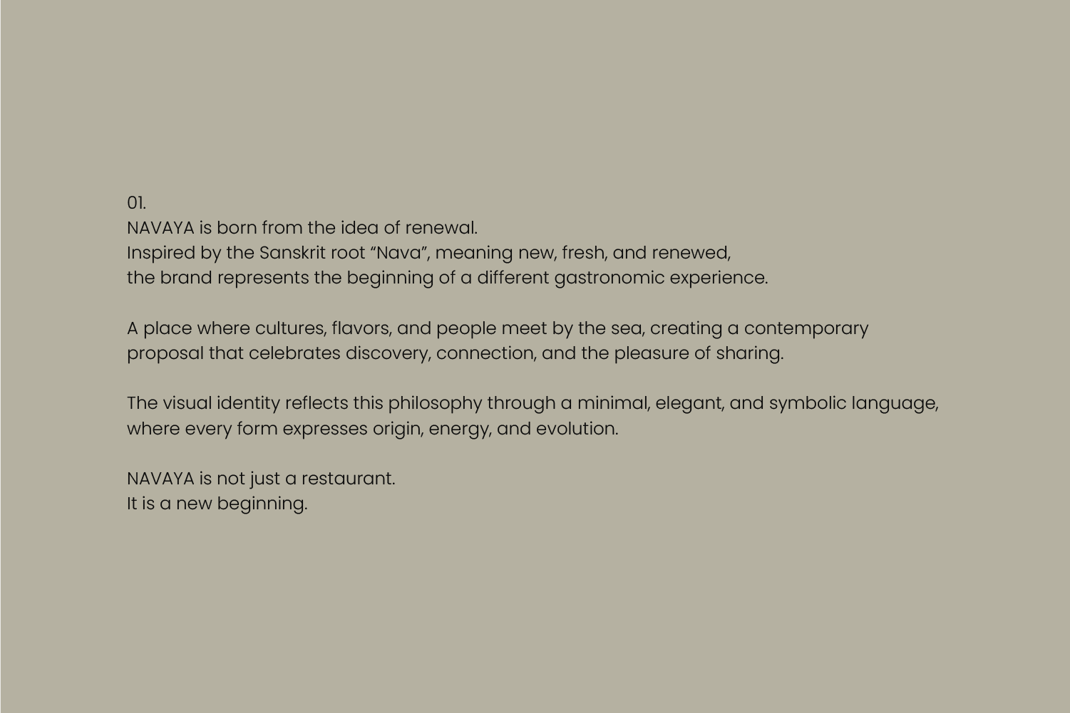
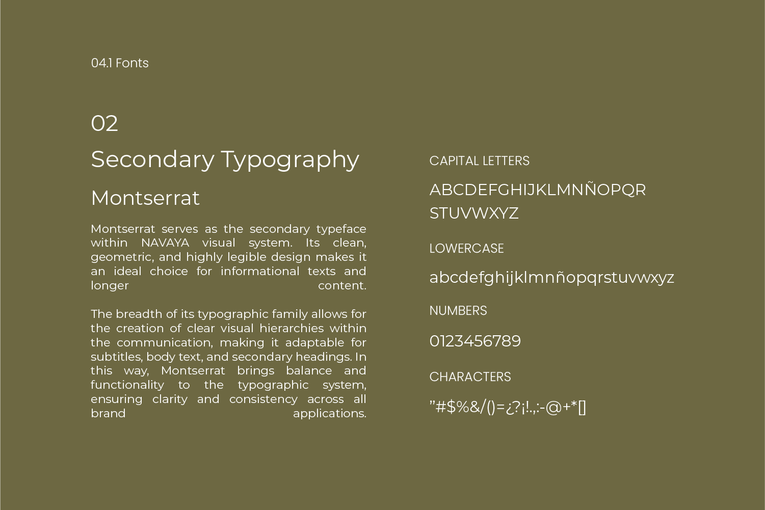
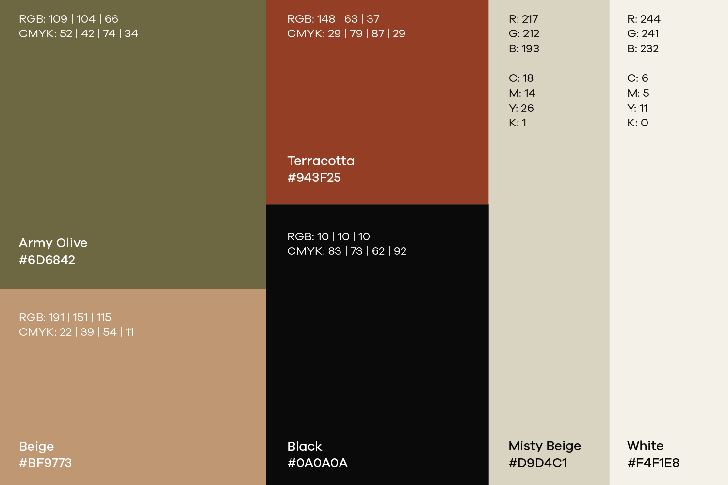
We started from the positioning and the traits that the brand needed to convey. From there, we built the symbol, word, typography, color, composition, and visual behavior.
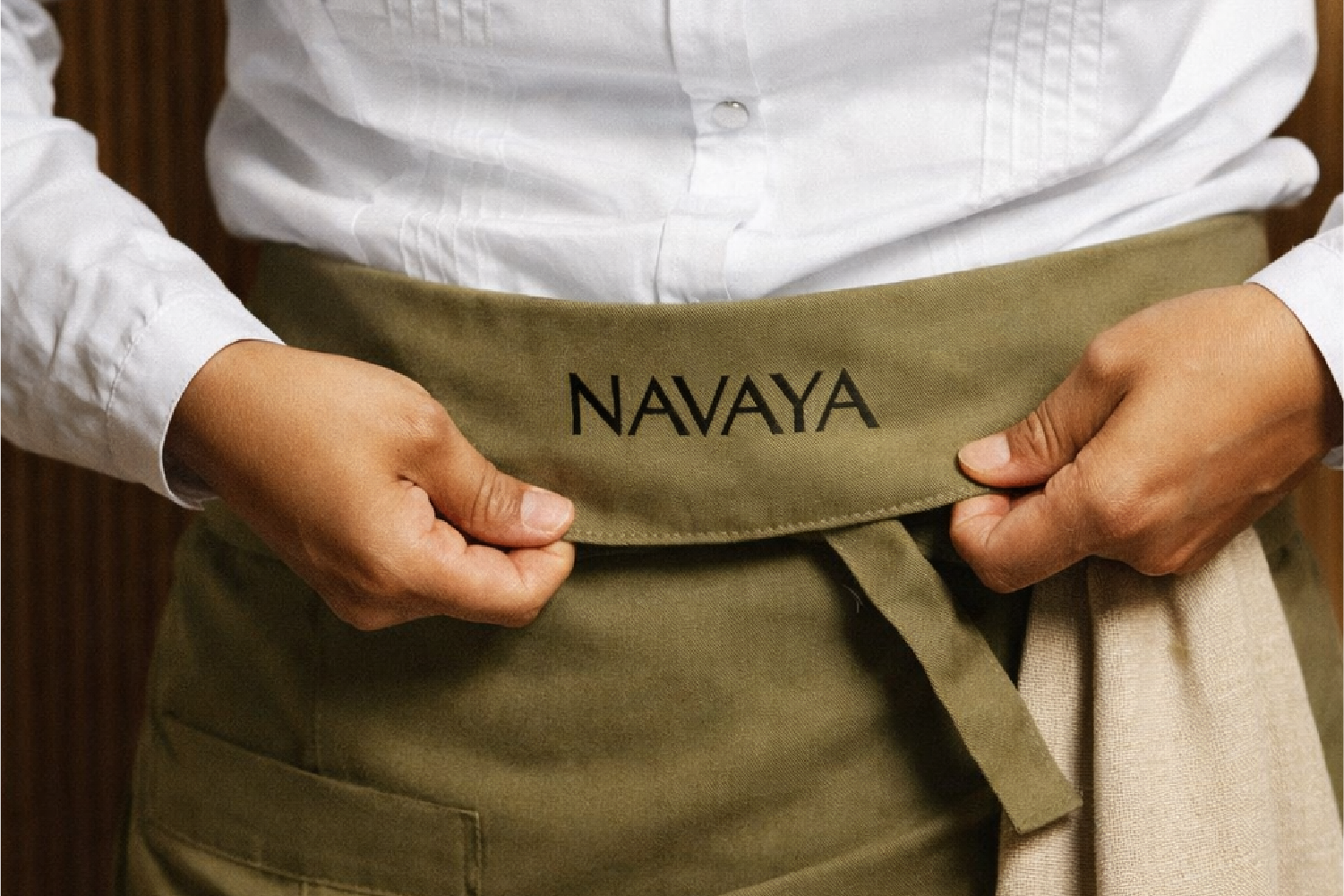
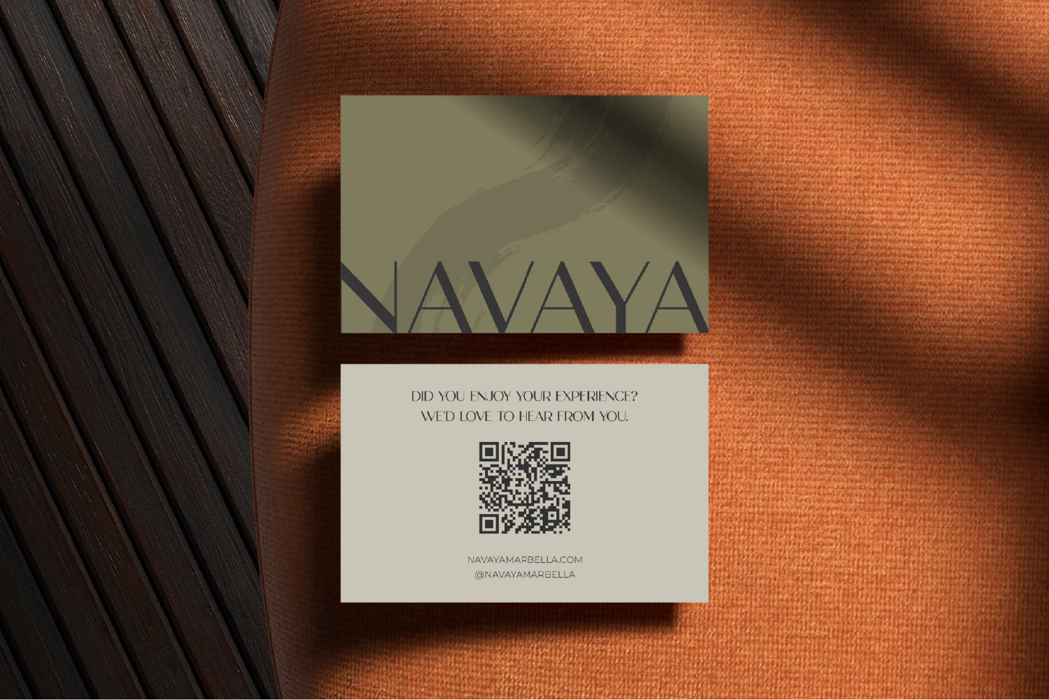
Identity was directly tested on real applications to verify hierarchy, flexibility, and consistency before closing the system.
- PROJECT GALLERY
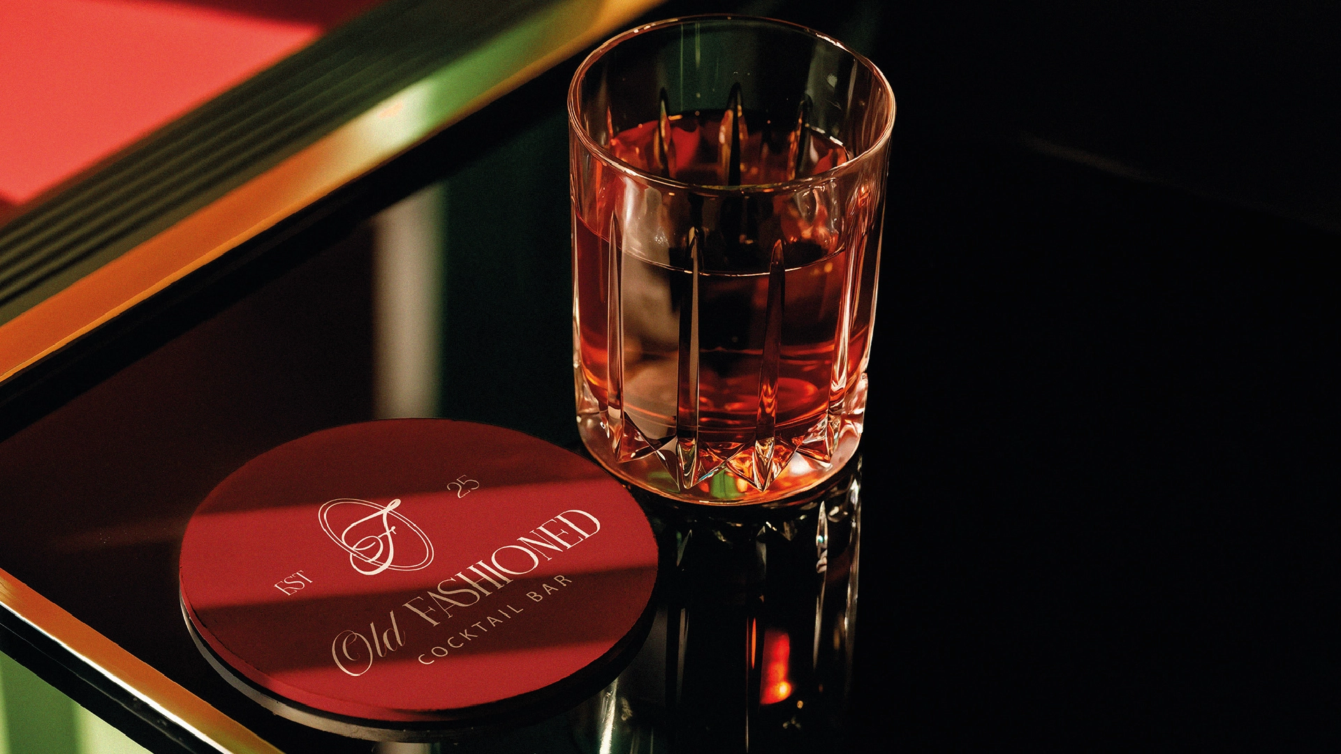
The brand put to work.
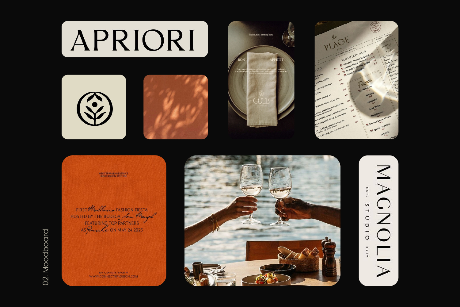
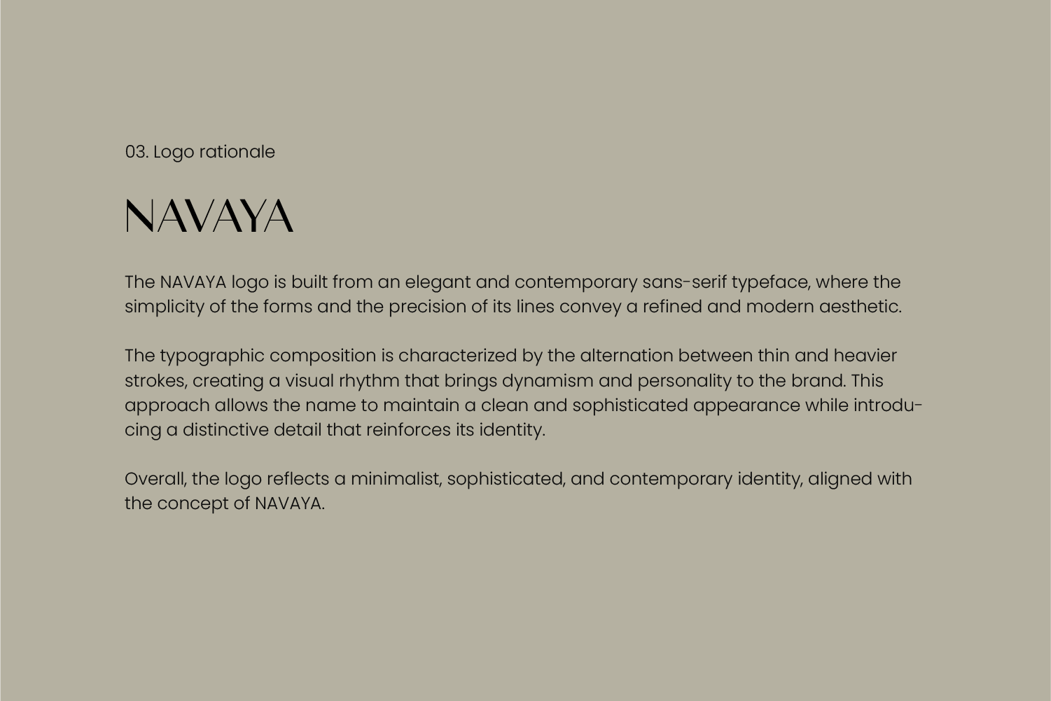
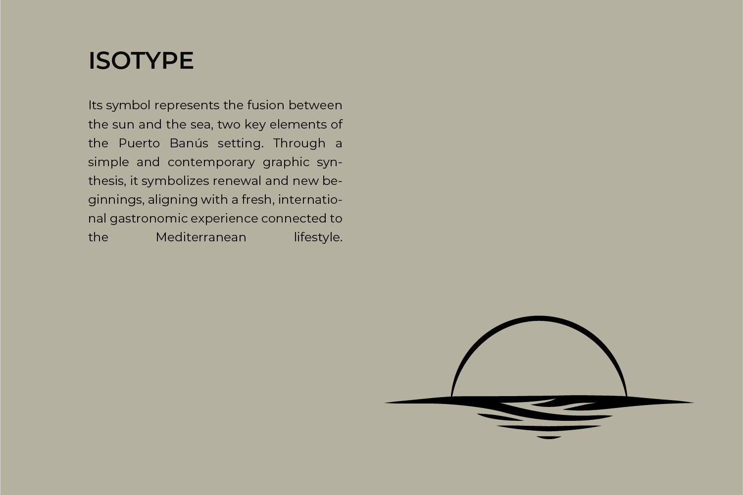
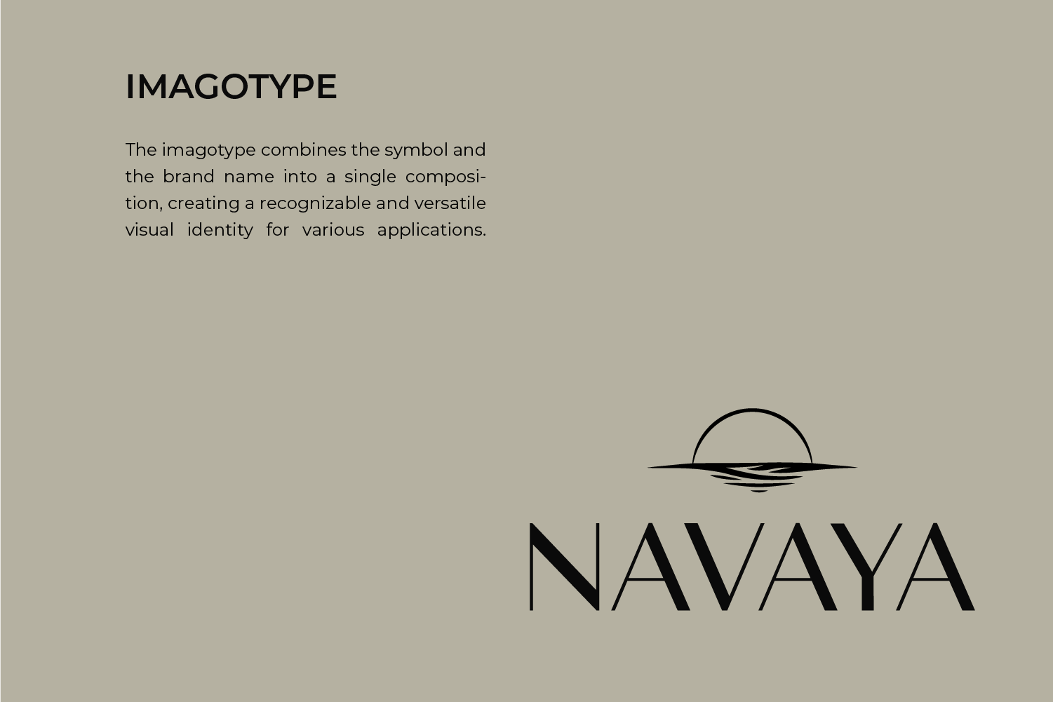
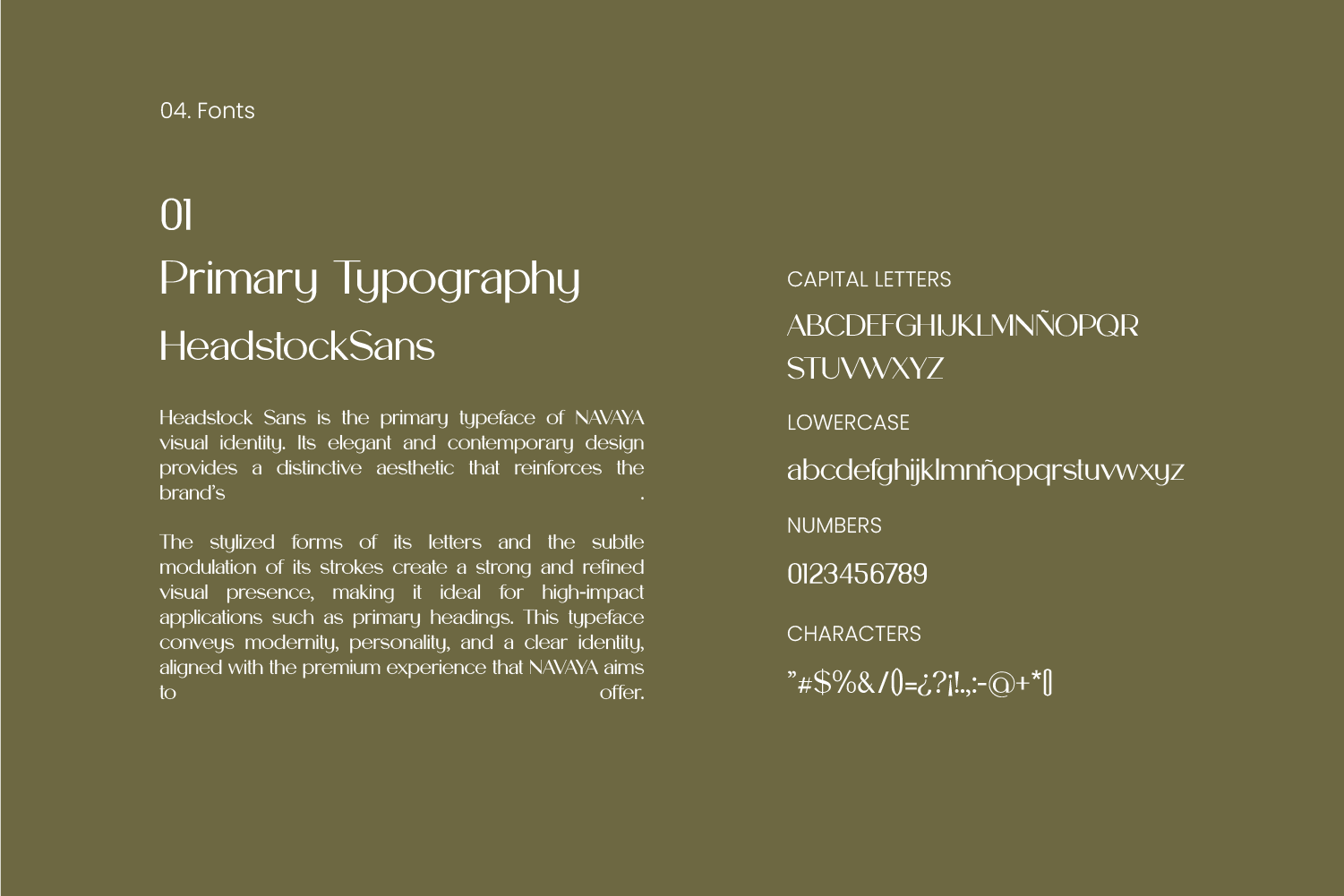
A journey through the concept, visual system, and applications that shaped Navaya
- HOW WE WORK IT
01
Definition
Position, personality, references, and criteria for decision-making with a common direction.
02
System
Visual identity designed as a set of rules, not as an isolated resource.
03
Application
Tests at real touchpoints and tools to maintain consistency.
- THE RESULT
A visual foundation capable of growing with Navaya.
The result is an identity ready to be recognized and applied with consistency, without limiting the brand's future needs.